
Scooter Dashboard
Designing a safer, calmer scooter dashboard optimised for glanceability, clarity, and in-motion use.
Type
Timeframe
5 months
Toolkit
Figma · Miro
Year
2023

Problem
Most scooter dashboards prioritise feature density over clarity. Riders are shown too much information at once, making interfaces hard to read in motion, difficult to see in sunlight, and cognitively demanding — often pushing riders toward unsafe phone usage for navigation and communication.
Solution
Design a calm, hybrid digital-analog dashboard that surfaces only essential information, supports glanceable reading, and integrates safety and navigation without distraction. The focus was on reducing cognitive load, improving visibility, and supporting safer riding behaviour through thoughtful UX decisions.
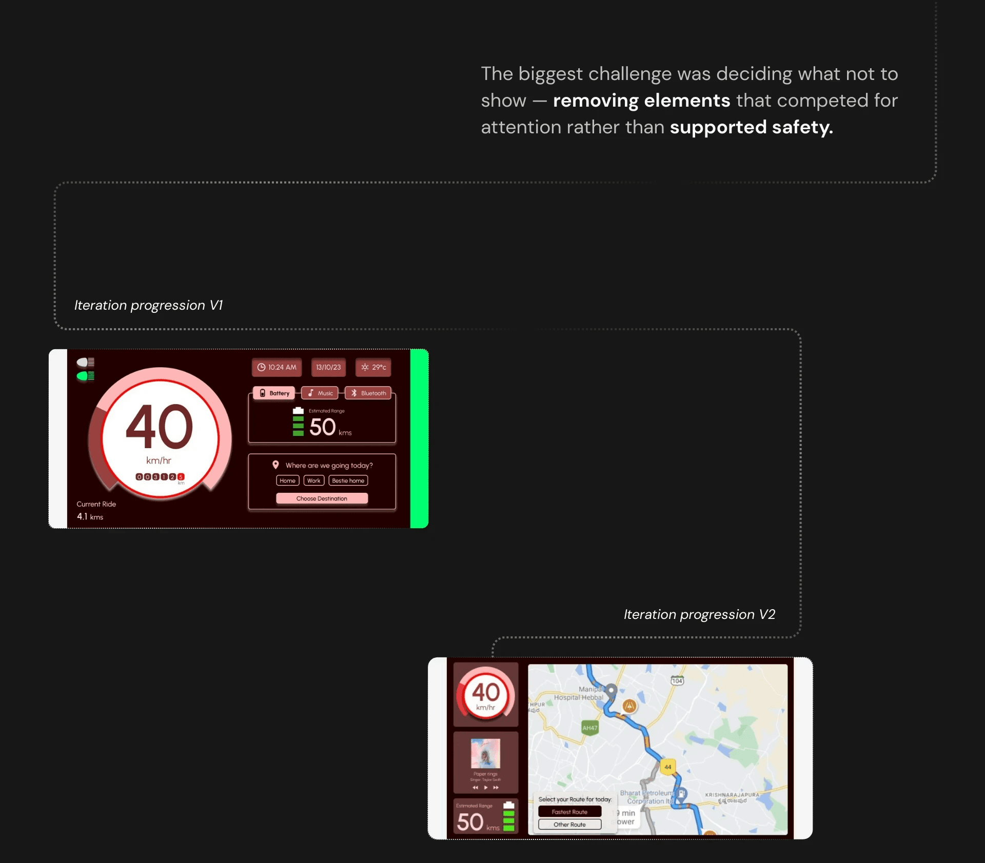
On a scooter, attention is safety. Every unnecessary element becomes a risk.
Before designing, I analysed how riders interact with dashboards while in motion and how existing interfaces contribute to distraction.
This helped surface the core issues:
Too much information shown simultaneously
Poor readability in sunlight and motion
Digital interfaces competing with rider attention
Phone dependency increasing safety risks
These insights shaped the decision to design for reduction, not addition.
Research & Discovery
The aim was to ground design decisions in real riding conditions, not ideal scenarios.
Key Insights
Three key insights emerged from research:
Dense digital screens overwhelm riders in traffic
Analog elements are faster to read in motion and sunlight
Fewer, clearer cues improve rider awareness and safety
These insights informed both the visual language and information hierarchy of the dashboard.
Exploring Solutions
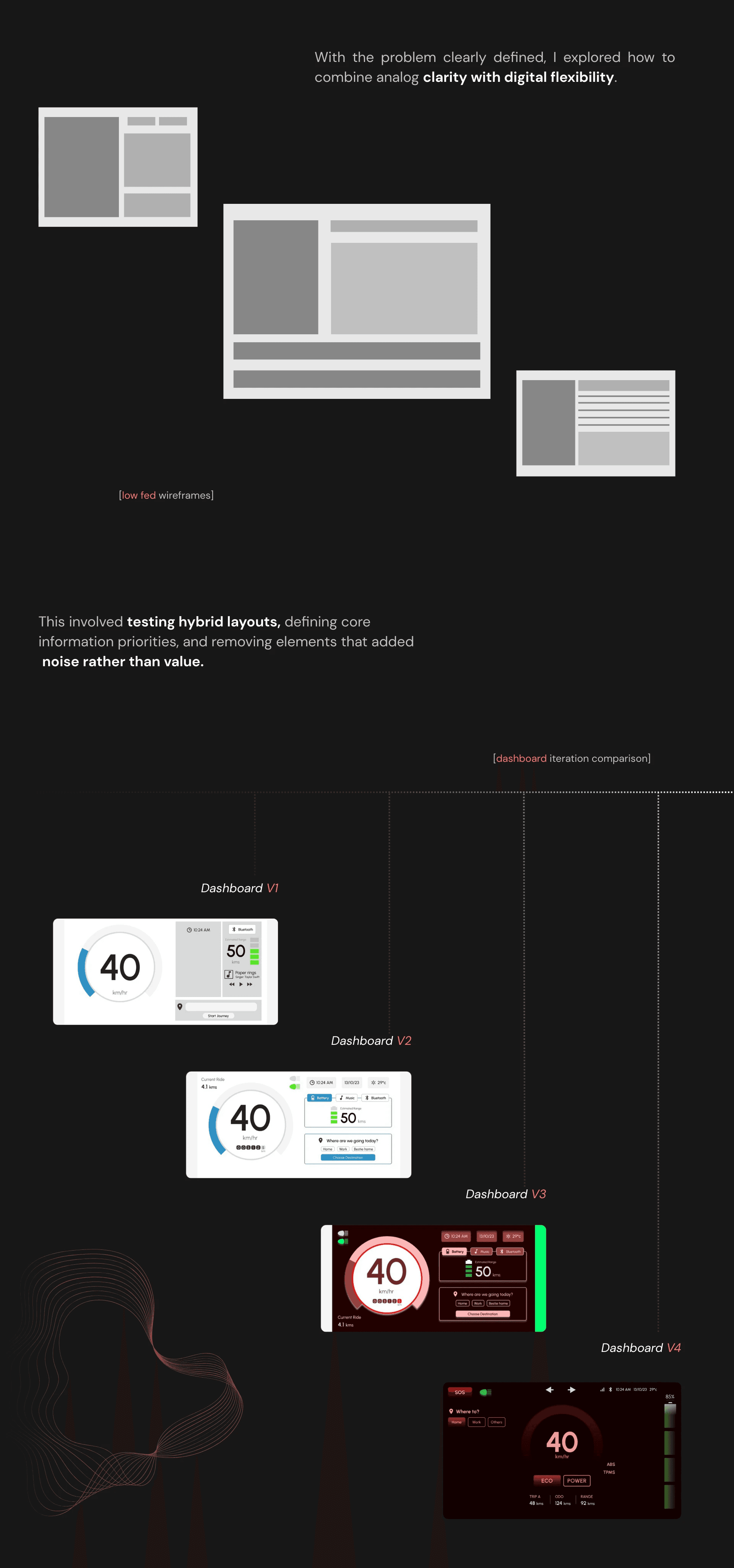
Validation & Iteration
Multiple iterations refined spacing, contrast, hierarchy, and prioritisation.
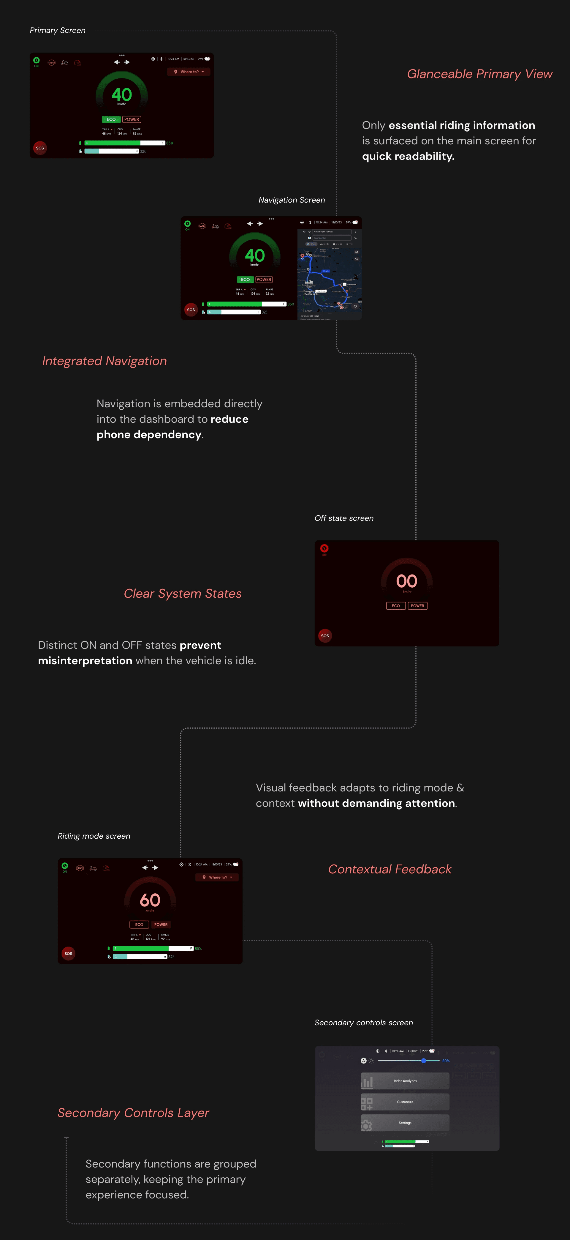
The Solution
Impact & Learnings
This project strengthened my ability to design for real-world constraints like motion, visibility, and attention.
It reinforced the importance of:
Defending simplicity
Designing for context, not just screens
Making confident trade-offs grounded in research


